
Tuesday, December 6, 2011
Not So Favorite Logo
Tuesday, November 29, 2011
American Spirit

While browsing through a recent issue of Glamour magazine, an ad for the American Spirit cigarettes immediately caught my eye. I don't know if it's because I do not smoke, but I have never seen this brand of ciagrettes before and have not seen another brand with packaging like this. I think it is a very "retro" look for something being sold in this time and era. I would say it's almost even an Art Deco look with the geometric shape and colors of the cirles and text. I really like it!
Harper's Bazaar: Now and Then
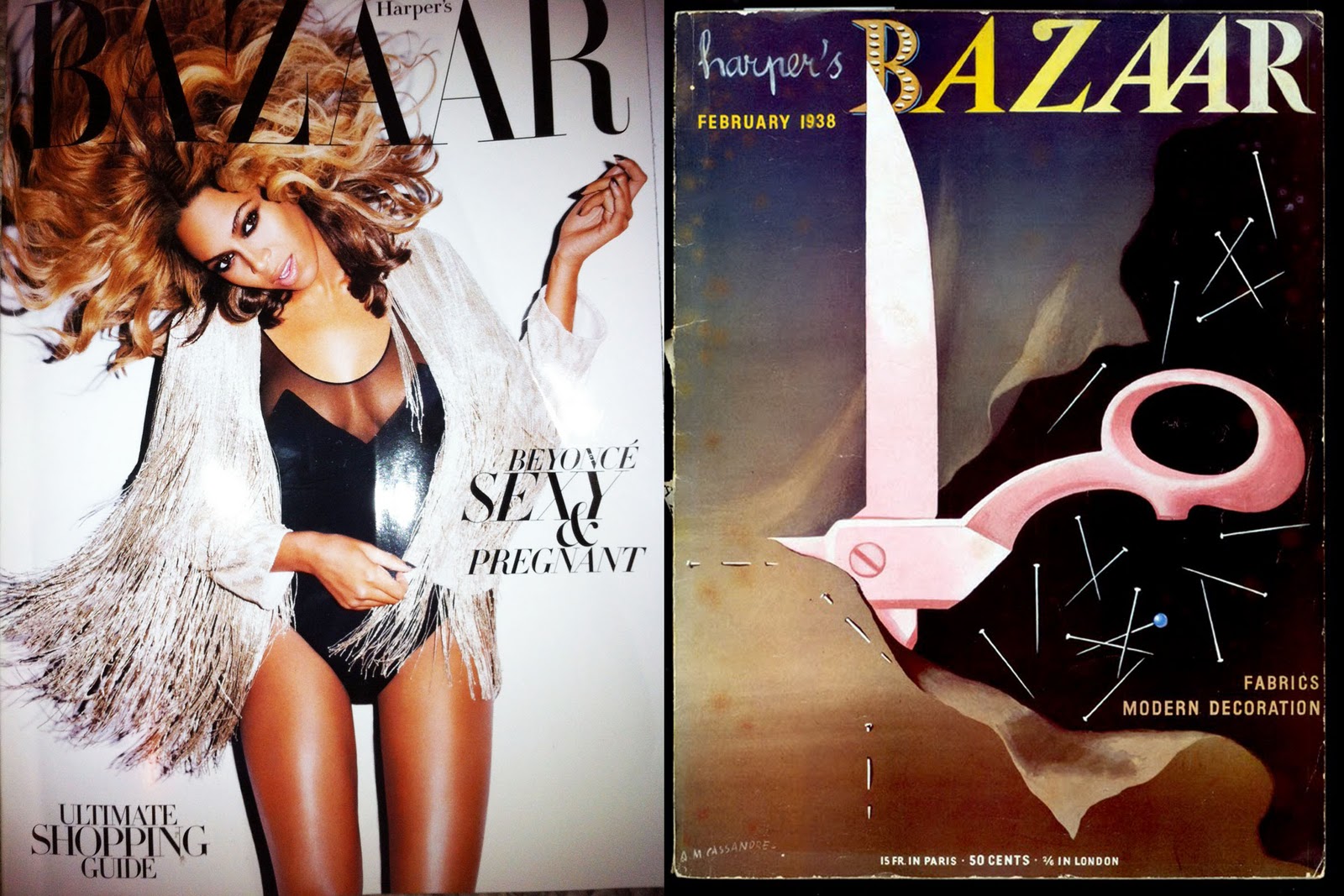
For this post, I combined a picture I took of a recent cover of Harpers Bazaar and combined it, using facebook, with a cover of Harper's Bazaar done in the 1930's by A.M. Cassandre. I am doing Cassandre for my second presentation so I have been researching a lot of his past art and have seen quite a few of his designs for the Harper Bazaar's covers and it just amazes me the difference between the cover design from then and now. The recent cover features an entertainment icon, singing sensation Beyonce Knowles with a relatively simple background with almost no color. The design by Cassandre is an abrstract illustration with a multitude of colors and is far from "simple."
Monday, November 21, 2011
Doodles

I absolutely love this restaurant sign for "Doodles." It is located on campus on the corner of Sixth and Daniel near the bar fire station. What really caught my eye were the tea cups used in the word "Doodles" in the places of the "Os." They also help show that it is a sign for an eating place, which is a clever advertising technique. I think that the font and the picture of the elephant go well together and create a nice unity in the picture.
Monday, October 10, 2011
UC-IMC Poster

I found this poster in the window of a movie store on the corner of Sixth and Green on U of I's campus. Although it was surrounded other posters, this poster immdiately caught my eye. The almost abstract appeal to it caught my eye and made me look at it even longer, to try and figure out what it was. I love how the artist is using the piano teeth and little man with the microphone to convey it has to do with the media, such as the radio. I also like the fun, decorative font that does with the theme of the poster. I think it is very well balance and visually appealing.
Graphic Design Saves Us

Walking down Green Street across from the Champaign Public Library I found this yard with the "For Sale" sign very amusing. Both of these signs are for the same property for sale and are both visually communicating the message, with the same exact words, but yet look so different as far as style. The sign to the right, farther off in the distance which is an example of graphic design is so much more visually appealing to the viewer than the hand painted one with it's sans serif font and nice crisp lines. This example shows us a slight glimpse of what it would be like without the usefulness of graphic design to display messages.
Sunday, September 25, 2011
Interesting...font?

Browsing through an issue of InStyle magazine I came across this Borghese ad and it immediately caught my eye because of the words "Do You Fango?" because of the way it was written. My first thought was it was painted on using photoshop or another design software. I then wondered if that was a text face made to look like font. Either way, I really liked how different the letters were versus the designer using a "normal" looking typeface for the ad.
Thursday, September 22, 2011
Graphic Design "Look"

I wanted to post this excerpt from an article in an issue from a Cosmopolitan magazine because I found it very interesting in what defines a "graphic designer" type like the author of this column wrote. My guess after reading this would be both of them having mac lap tops in front of them with, sipping lattes, and possessing sort of a boho/hipster look - but then again I am in the graphic design program and I don't like coffee and would describe my style as completely simple and plain.
Sunday, September 18, 2011
Eye-Catching Ad

Flipping through the October issue of Cosmopolitan magazine, my eyes were instantly drawn to this Nike Ad because of the distressed font. I love the simplicity of the ad, the colors, and also how the type brings your eyes down to what the Ad is trying to sell, the shoes.
Friday, September 9, 2011
Not So Favorable Graphic Art

Walking down Green Street, I immediately noticed this sign - but not for a good reason. The very top "ad" caught my attention because of how terribly the color design was. This could easily be personal opinion, and others love it, but I found the letters of the word "HOLLYWOOD" blending into the yellow on the top of the design, making it very legible to read. Looking at it was almost like hearing nails on a chalk board for me, so I decided to make this blog about how graphic design can go wrong.
Monday, September 5, 2011
Blog #1 Dollar Java Coffee Shop

"Dollar Java"
Walking down Green Street, I noticed this sign out of the corner of my eye. Mainly because it is a huge board with little illustration, so my eyes immediately went to it's main focal point which is the name of the coffee shop and the illustration showing what they want to advertise- their dollar cup of copy. I also really like the design of the coffee smoke forming into a dollar!
Subscribe to:
Posts (Atom)